Thursday, April 28, 2016

GIS4043 - Final Project - FPL Bobwhite_Manatee Transmission Line

Overview FPL Bobwhite-Manatee Proposed Transmission Line

Our final task was to analyze a proposed transmission line corridor from Florida Power and Light (FPL).

Our four main objectives for this analysis are to:

1. Define and quantify environmentally sensitive lands imposed by the transmission line.
We will utilized data provided by the National Wetlands Inventory to determine wetlands and uplands impacted by the corridor as well as data provided by the Florida Natural Areas Inventory.

2. Quantify homes within the proximity of the transmission line.  We will use aerial images of Manatee and Sarasota counties to digitize residences located within the corridor as well as those located within a 400 foot buffer surrounding the corridor.   We will also provide a count of the total parcels affected by the corridor and buffer in both counties.

3. Define schools and daycare centers within proximity of the transmission line corridor and 400 foot buffer zone.   School and daycare data retrieved is from the University of Florida GeoPlan Center.

4. Quantify the length of the transmission line.  (I did not choose to show the optional engineering cost associated with this transmission line).

The Bobwhite-Manatee proposed transmission line placement is acceptable and feasible based on the chosen project objectives and criteria.

It avoids large areas of environmentally sensitive lands.   No private conservation lands are impacted by the transmission line corridor. 164 Acres – Local and State Conservation Areas Impacted By Proposed Corridor
91 Acres – Heritage Ranch Conservation Easement (Local)
63 Acres – Lake Manatee State Park (State)
10 Acres – Lake Manatee Lower Watershed
914 Acres – Wetlands (National Wildlife Inventory) – 5% of wetlands in Study Area
5,652 Acres – Uplands (National Wildlife Inventory) – 5% of uplands in Study Area

It has relatively few homes in close proximity.  It is estimated that less than fifty homes would be impacted by the proposed transmission line.   Thirty-five homes in Manatee County and eleven homes in Sarasota County resided either directly in the corridor or within the 400 foot buffer surrounding the corridor.   

It avoids schools and schools sites including daycare centers.  No schools or daycare centers fall within either the corridor or the 400 foot buffer surrounding the corridor.  Sprouts Child Development Center is the closest in proximity, located less than one-fourth a mile from the 400 foot buffer zone and less than one-third of a mile from the proposed corridor.


The transmission line is approximately 25 miles in length.

GIS4043 Final Project Power Point Presentation

GIS4043 Final Project Presentation Slide Notes

Wednesday, April 27, 2016

GIS3015 - Final Project - 2014 SAT Results

GIS3015 - Final Project - 2014 SAT Results
Well it's here! My last blog entry for GIS3015.   What a journey it has been returning to school after so many years and online!

Our final project assignment tasked us to be an employee of the U.S. Dept. of Education's National Center for Education Statistics.  The Washington Post is working on an article about 2014 SAT results and need a map of the data results to accompany their article.  Specifically, we've been asked to create a single map showing 2014 mean composite SAT scores and student participation rates for the entire United States, including the District of Columbia.  The map will employ two different thematic methods to present the data and show correlation of data sets, if any.  The map will aid readers of the Washington Post in interpreting the provided results of the 2014 SAT exam.

For my map I chose to use a choropleth map to show the 2014 mean composite SAT scores by state.  The fifty United States and the District of Columbia are shaded by intensity proportional to the mean composite score associated with each state.   Using the Color Brewer website I selected a sequential multi-hue color scheme the unipolar mean score data from low to high values.  Because the map would be viewed by a wide audience and in print I made a selection that was color-blind safe and print friendly.  Graduated symbols were used to represent the differences in magnitude between the percent participation rates among graduates who took the 2014 SAT exam.  Because participation rates ranged from 2%-100% a range of data values could be represented by a specific symbol size using graduated symbols and make the data less difficult to interpret.

The Natural Breaks classification method was used to classify the mean composite score data into five classes.   This method grouped similar data point values together while also providing enough data points in each break.  I originally classified the percent participation rate data using the Natural Breaks method as well.   Five classes created interval ranges that were too large.   Six classes provided better groupings for analysis.  I used the Manual method to modify the Natural Breaks method slightly by adjusting the break values that would clearly show the difference in symbol size in relation to the percentage differences.

The focal center of this map was the contiguous United States.  I used an Albers Equal Area Conic projection and reprojected the same shapefile to Alaska Albers Equal Area and Hawaii Albers Equal Area to create data frames for Alaska and Hawaii.  These two additional data frames enabled me to effectively use map space and to orient the two states on the map relative to their true geographic locations.  An inset map was also added to enlarge the upper Mid-Atlantic and New England region that was densely populated with graduated symbols due to the small geographic area.  The inset map required that I identify the area being enlarged on the contiguous data frame.   I used the Inner Glow effect to "lighten" the choropleth symbology as well as the Transparency tool to decrease the opacity of the graduated symbols.  The inset map provided its own challenges due to the large area which needed to be displayed within limited map space.  The areal units for Rhode Island, Delaware, and the District of Columbia were very small comparatively to the rest of the map and the graduated symbols obscured large portions or all of the enumeration units.   Using the Pathfinder Divide tool I was able to create three separate segments from overlapping graduated symbols that appeared similar to Venn Diagrams.   This tool enabled me to then use Transparency to alter the opacity once again so the colored enumeration units underneath would not be obscured.

Displaying just the mean composite scores on the United States map, the map audience might make biased assumptions such as the Midwest has smarter students or better schools because they all had mean composite scores above the national mean of 1590.  However, when the data was displayed alongside the student participation rate the map audience may make a different interpretation.  19 of the 23 states with the highest composite mean scores had 8% or less participation from their high school graduates.   Conversely, 22 of the 23 states with the lowest composite mean scores had participation rates greater than 54%.  The three locations with 100% participation, Delaware, Idaho, and the District of Columbia also had the three lowest mean composite scores.  Noteworthy states were Massachusetts, Connecticut, and New Jersey which had student participation rates of 84, 88, 79% respectively and also had the 25th, 31st, and 30th highest mean scores.

By using both choropleth mapping and graduated symbols to represent the data sets on one map we more easily communicate the data and show the correlation between the two and prevent the audience from making assumptions without understanding the relationship between the data.

This assignment enabled me to use skills acquired throughout the semester to create a map for a realistic scenario.  With each assignment, I gained new insight into the world of cartography and realized its power to convey information in both a positive and negative way.   We live in a world that wants to rank and make comparisons, especially in public education.  This course has enabled me to see how immensely helpful maps and GIS can be in providing the end user the information they need to make thoughtful decisions.

Thank you for helping this Cartographic Neophyte enter this journey towards certification and gain a solid foundation of understanding to prepare for future courses and experiences.

Sunday, April 10, 2016

GIS3015 - Module 12 - Google Earth

Population Density Of South Florida
Downtown Miami Viewed From Google Earth
NeoCartography!  and our final Module!  This week's lecture and lab focused on VGI, PPGIS, and NeoCartography.  Volunteer Geographic Information (VGI) is here to stay.   How we use it and verify it were the main points of the lecture and participation discussion.   I am a fan as I believe more input is better even if it means devoting time, effort, and resources to verifying the input.  Public Participation GIS is just that, the public contributing as neo-cartographers.   Sometimes, "a picture is worth a thousand words" and until people see an issue they don't even think about it.   PPGIS  can also enable the public to feel and be useful and provide input into decisions that directly affect them.

The lab's focus was learning about and navigating in Google Earth.   Using the South Florida Population Dot Density map from Module 10 we created a map in Google Earth.   I am definitely a novice Google Earth user but this lab provided me the basic tools to begin to navigate through South Florida.  I had to recreate a simpler version of my dot density map in ArcMap first.  Next, we created tour of designated destinations in South Florida.   Navigating is one thing and creating a "tour" with my limited navigation skills is another. Using the 3D viewing keyboard and mouse shortcuts helped tremendously. https://support.google.com/earth/answer/148115?hl=en

This final module was interesting in that I continue to realize the variety of ways Cartography is used in our world today.   Google Earth is a powerful application that aids either the expert or novice cartographer in creating an output to communicate with a variety of audiences.  Technology is changing our world so rapidly just in my lifetime; the ability to see and show other parts of our world is fascinating.

Thursday, April 7, 2016

GIS4043 - Week 13 - Georeferencing

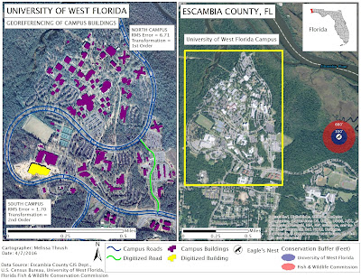
MAP1: Georeferenced Buildings On And Eagle's Nest Near UWF's Campus
Difficult to believe this is our final lab assignment for GIS4043!  This week's lab was primarily focused on Georeferencing.   Georeferencing is used to align an unreferenced aerial photograph with an already referenced control layer.  In Section 1, we were provided two unreferenced aerial photographs of UWF's campus, uwf_n.jpg and uwf_s1.jpg representing the northern and southern parts of the main campus.   Our two referenced layers were a campus roads layer (UWF_roads) and a campus buildings layer (Buildings).  We then worked on referencing the North Campus layer using the Add Control Points tool to identify 10 common points on the target layer and on the already referenced control layer.  I went through this process a few times before I learned that the key was zooming and trying to select as close to the exact same spot on the unreferenced layer and the referenced layer.   Using the View Links Table we could see our Root Mean Squared (RMS) Error value which had to be less than 15.  I selected 10 common points using a 1st order transformation and a RMS Error of 6.71.   These 10 points then allowed us to "Update" georeferencing and provide a spatial reference for the North Campus layer (uwf_n.jpg).  It took me a few trials to get more proficient at adding control points with accuracy.  The second part of Section 1 of the lab had us georeference the southern part of the campus.  After we used 1st order transformation to create at least 6 common links we then changed the transformation to 2nd order.   After creating 10 common links we could change the transformation to 3rd order.  Higher transformation orders allow the raster image to "bend and warp" more.   Ideally you want to select the transformation order that presents your image most accurately.  I chose to use a 2nd order transformation and had a RMS Error of 1.70.

In Section 2 of the lab we learned how to use the Editing Tool to create new features in our map.   Using this tool and some basic editing techniques we created a new building in our Buildings layer and added a new road to our UWF_roads layer.  I am glad we learned how to use this tool as it definitely appears to be one that will come in handy.

In Section 3 we learned how to use the Multi-ring buffer tool to create two separate buffer zones around a located eagle's nest but have the buffer zones appear together as one feature.   We even learned how to add a hyperlink that displayed a photograph of the actual eagle's nest!

In Section 4 we used ArcScene to create a 3D image of the UWF Campus.   We used a DEM from Labins.org to create a "relief" for the other layers (Buildings, UWF_roads, and the aerial photographs of northern campus and southern campus) via the Base Height tab.  We used the extrude tool to extrude the campus buildings on the map.  Because the image still appeared "flat" we applied vertical exaggeration to the Scene to make it appear more three dimensional.

This lab was intensive but covered several important tools and techniques that I am sure to encounter again.
MAP2: UWF Campus Image Created In ArcScene Using a DEM

Friday, April 1, 2016

GIS3015 - Module 11 - 3D Mapping

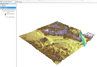
Figure 1: Vertical Exaggeration of Twin Cities Elevation (MN)
In this week's Module, 3D Mapping, we first worked through an ESRI Training Module on 3D Visualization Techniques Using ArcGIS.  This training module introduced new terms in addition to new techniques.   We learned about Triangulated Irregular Networks (TINs), Terrain Datasets, and Multipatches.  The primary focus was working with 3D features, discrete geographic features such as buildings, rivers, and wells that can be found on or beneath a surface.  We used ArcScene to display 2D features in a 3D perspective.  The first portion of the training taught us how to navigate within ArcScene and view 3D data and how to use the Attribute Table's Shape field to determine if our data was a 3D feature class.  Next, we learned how to set Base Heights for raster data which are set to  0 by default.   Lastly, we learned techniques that enhance 3D views.  In Figure 1, we changed the visual effect of raster elevation data for the Twin Cities of Minnesota by exaggerating the differences in elevation values.   The "exaggeration" technique does not alter the measured values but changes their appearance.  A negative exaggeration has the effect of "inverting" the data's appearance.  By changing "illumination" values and background colors you can alter the appearance of data.   Changes to the appearance of the sun's light (angle or altitude) has the effect of emphasizing or reducing variations seen in the 3D surface.  The use of a background color can make a 3D layer "pop" or appear to float or provide geographic reference (sky, horizon, water body).

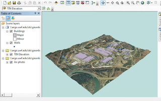
Figure 2: Extrusion Of Buildings And Wells Using Elevation and Depth Values
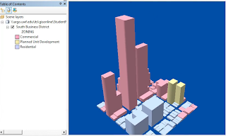
Figure 3: Extrusion Of Parcels in Manhattan, Kansas Using Property Values
In Figure 2, we used the "extrusion" technique to extend features above and below the surface.   Buildings were extruded above the surface using their Height value and Wells were extruded below the surface using their Depth value.  Because wells appeared as flat points on the surface we applied an offset value to raise them slightly above the surface.  The "air photo" or picture layer in this figure was "draped" over the underlying elevation TIN layer, by setting the photo's base height to the elevation values of the TIN.

In Figure 3, we showed that z-values do not have to always represent height.  In this example, building parcels in Manhatten, Kansas were extruded based on their property value attribute.  Properties with a higher total value were extruded more than lower valued properties.  Sometimes, z-values may not be proportional to their x,y values.   In this example we had to also apply vertical exaggeration to the features so they would appear proportionally.

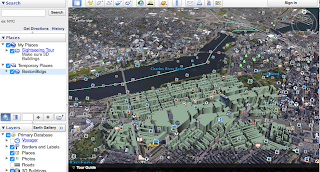
After completing the ESRI training course we moved on to our UWF exercise.  Using instructions and data provided by our professor and ArcGIS statistical tools we created sample points for 343 buildings in Boston.   With these points we performed calculations and determined a mean height for each building which represented our z-value.  The z-values were used to extrude the buildings in Boston.  We exported our extruded buildings data to create a layer and then converted that layer to a KML file.  Finally, we viewed our KML file in Google Earth as seen below in Figure 4.  The extruded buildings in Boston enable the viewer to visually focus on a specific area and view the buildings from different perspectives (above, street level, from different directions) as well as compare building heights relatively easily.

Figure 4: Extruded Buildings In Boston Displayed Via Google Earth
Lastly, we took another look at Charles Minard's famous map of Napoleon's Russian Campaign of 1812 and compared it with Kenneth Field's and Nathan Shepherd's 3D version.  I really enjoyed this lab and some of the discussion posts by a classmate about Space Archeology.