Sunday, February 28, 2016

GIS3015 - Module 7 - Choropleth Mapping

Choropleth and Graduated Symbol Map of European Continent
In Module 7 we learned how to create a Choropleth map and the importance of understanding the data you are trying to present.   The first part of the lab had us take an in depth look at the attribute table.   The provided data set was for the continent of Europe.   We focused on two fields, population density and wine consumption.  First, we had to choose how to display the differences in population density across the continent.   I chose to use a multi-hued sequential color scheme on Color Brewer and copied the RGB values to create a color ramp.   Secondly, we had to choose how to classify the data.  After, viewing the various standard data classification methods,  I chose the Natural Breaks method to sort the data into 5 classes.  This method grouped similar data point values together while also providing enough data points in each break.

Next, we looked at the wine consumption data using two different types of symbols, proportional and graduated.  Differences in discrete data, like counts, can be presented using visually variable sized symbols.  Proportional symbols are unclassed and Graduated symbols are classed.  I chose to use graduated symbols to best display wine consumption across the different European countries.  I felt graduated symbols made the wine consumption data less difficult to interpret.   I chose the Manual data classification method to classify the wine consumption data using 5 symbols.   This method enabled similar data point values to be grouped together as well as providing enough data points in each class to make adequate data interpretations.   The outlier of this data field was Vatican City, which had the highest percentage of wine consumption.  This data point was in a class by itself and it makes sense to show the map reader that it is an outlier as Mass is held daily and thus wine is consumed regularly.  Areas with typically lower population density in general were not wine consumers with the exception of Latvia.  Not surprisingly, countries closer to the Mediterranean Sea and the wine producing countries of France and Italy had higher wine consumption.

This lab was a challenge, especially the fine tuning requirements needed to be performed in Adobe Illustrator.   I also learned how to create different legend styles in ArcMap.

Sunday, February 21, 2016

GIS 3015 - Module 6 - Data Classification

Comparison of Data Classification Methods
Total Population 65 Years Old or Older Per Square Mile
In this week's lab assignment we learned about four common data classification methods.  Using data from the 2010 US Census we mapped Dade County, Florida by Census Tract using the different classification methods.  The Equal Interval method creates class intervals by dividing the range of data by the number of classes.  The Quantile method rank orders the data and an equal number of observations are placed in each class.  The Quantile method is useful when classifying ordinal-level data.  The class intervals are calculated by dividing the total number of observations by the number of classes.   Both of these methods are easy to use because the intervals can be determined with simple calculations and the intervals in both methods are easy for the map audience to interpret.  When using the Equal Interval method, the legend limits match the lower and upper limits of each class; i.e. no "gaps".  The Quantile method however, can cause there to be data "gaps" which can be confusing to the map reader.  More importantly, both of these methods fail to consider the distribution of the data.  Outlier data observations can be grouped or classed with distinctly different observations.   Also, some class intervals might not have any data observations.

The Mean-Standard Deviation method does consider how the data is distributed long the number line. Class intervals are created by calculating the data mean and adding and subtracting the standard deviation from this mean.  This method assumes that the data is normally distributed.  If the created class intervals have a negative range they may be empty due to no observations in this range.  The Mean-Standard Deviation method assumes that the map audience has some level of statistical training in order to interpret the mapped data.  The final method we reviewed is the Natural Breaks method. This method considers the "natural" groupings present in the data.  Sometimes, data can be visually examined to determine logical breaks.   This method minimizes the differences between the data values within a class and maximizes the data differences between the classes.  An obvious disadvantage is that this method can be subjective in that natural break decisions can vary among map creators.

Our first map employed the four different classification methods described above to display the Percent of Population 65 years old and older in Dade County, Florida by Census Tract.   Using the symbology tab we used graduated color schemes to display the PCT_65ABV field using the four classification methods.  I chose to create a sequential single hued green color scheme from Color Brewer to create my own color scheme in ArcMap.  Because the lower values were a light shade of green I chose to have a grey background behind the Dade County Tracts for each classification data frame.  This enabled the user to more readily see the lighter hues especially along the coastlines.  To invoke figure-ground I chose to make the background of the frameline a darker shade of grey.  Each data frame has its own legend to display the data ranges created for each class interval under each method.  Once I stylized one legend, I realized I could copy and paste the legend into another data frame and have it use the data layer in that corresponding data frame.  This helped me tremendously as stylizing the map usually takes up the majority of my time devoted to the lab assignment.  I included essential map elements after ensuring that each data frame was presented at the same scale.

Our second map used the same U.S. Census Bureau shapefile and four different classification methods, but this time we used the population field of AGE_65_UP and normalized the data by area in square miles.   This map displays the population density of persons 65 years old or older.   This is a more accurate depiction of the data.   The data in map 1 can be misleading because a census tract may have a high percentage of seniors residing in that tract but there may not be a large population of people in that tract.   The first map also doesn't take into consideration the area of the county tract.  A large tract may be sparsely populated and a small tract may be densely populated.  By focusing the attention on the tracts with the highest senior population density one could target the most seniors in the least amount of coverage area.  In my opinion the second map (image shown above), presents the data in the most useful manner.

Viewing and analyzing the attribute table for the Dade County shapefile helped me understand the concepts and differences of the four data classification methods.   I did make a mistake of running a statistical tool by accident on one of the field columns.   I had to replace the shapefile with the original and thankfully all of my style and symbology edits were preserved.   This lab made me realize another aspect of understanding your map audience.   It is important to know why and how a map will be used.   In addition to providing an aesthetically pleasing map, knowing your data and how to present it is even more important.   In the case of this lab assignment, how the data is presented could impact the interpretation and therefore the use of the map data to make to future decisions.

Thursday, February 18, 2016

GIS4043 Week 6 Projections Part 2


Crude 5 Layer Map of Escambia STCM Sites
In this second phase of our Projection lesson we learned how to download data from different sources such as Labins.org and the FGDL Metadata Explorer.   We also learned how to create XY data using Excel and how to add that XY data to an ArcMap map and create a shapefile.  Part 1 and Part 2 steps enabled me to become more comfortable with understanding the different projections and where to look for them.  I also gained confidence using ArcMap tools such as Project, that enable the map creator to "reproject" layers so they match.  After proceeding through Part 1 and Part 2 of the lab, I was adequately prepared to tackle the requirements of Part 3.   After I downloaded the required data and I reprojected the layers to the same projection (NAD_1983_StatePlane_Florida_North_FIPS_0903_Feet) I created my crude map of 5 layers which inlcudes: Escambia County STCM sites, county boundaries, major roads, 4 aerial images of Perdido Bay {5160 quad of Escambia County}, and Quarter Quad Index.  I also added an imagery Basemap to ensure I had all layers aligned/projected correctly.  I changed the symbology of the Escambia STCM layer to an above ground storage tank symbol.  I also took a screen shot of the layers before and after setting Transparency on the Quarter Quad Index layer to the Area field.  Correct units in Feet are displayed in the bottom right corner.  The final screen shot shows the Data Frame Properties > Coordinate Systems Tab.
Crude 5 Layer Map of Escambia STCM Sites with Transparency
Data Frame Properties>Coordinate Systems Tab

Saturday, February 13, 2016

GIS 3015 - Module 5 - Spatial Statistics

In Module 5 we were provided the opportunity to take an ESRI virtual training course "Exploring Spatial Patterns in Your Data Using ArcGIS".  Through this online course we learned how to visually examine our data as well as perform an in-depth analysis.   First we visually looked at our map data, looking for higher concentrations and lower concentrations of weather station locations across Western Europe.  We also looked for absences of weather stations.  Next we used the "mean center" tool to determine the "average" location of a weather station.  The "median center" tool was used to determine the "middle" of the ordered station location data set.   The "directional distribution" tool created a standard deviational ellipse showing the orientation of the data set (east-west).  All of these tools created a new layer in our map enabling us to change the symbology of each location. 

My map shows weather station locations throughout Western Europe.   I have denoted these stations with a red symbol.   The mean center (green circle) and median center (yellow cross) are also displayed.  Because the mean and median are similarly located that indicates our data is symmetric and has very little skewness.  A purple ellipse shows the directional distribution of the data set (east west). 

In the second part of the training, we were able to evaluate if our data was normally distributed by creating and viewing a histogram and Normal QQ Plot.  First we viewed statistics of the temperature field in the attribute table.   To create our histogram and Normal QQ Plot we used the tools found under the Geostatistical Analyst Menu. 

We continued to analyze our data set by exploring more tools under this menu such as Voroni Map, Semivariogram, and Trend Analysis.   All of these tools enabled us to further explore our data set, both the locations and the temperature values collected at each station.   We were able to determine that our data set was normally distributed and we identified an outlier weather station location in La Fretaz, France.  After thoroughly examining our data we can now select the correct analysis tool to aid in making a more accurate predication of locations where freeze warnings are needed.  The geostatistical tools led us to select geostatistical interpolation as the proper analysis technique.

GIS4043 - Week 5 - Projections Part 1


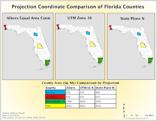
In this week's lab assignment we were tasked to learn about different projected coordinate systems and apply them to the same data set of Florida counties.  Using different projections we were able to see how differently the same data was displayed.    We learned how to use different Data Management Tools in the Arc Toolbox or via Search, specifically the Project Tool and the Project Raster Tool.

The Florida Counties data layer was originally projected in Albers Conical Equal Area projection.  An "Albers" layer was created in our Projection Comparison Map.  Then we used the Project Tool to create two new layers with new projection system.   The first new layer used the UTM 16N projection and the second new layer used the State Plane N (for Florida in US Feet) projection.   Each newly created layer was placed in a new data frame.   Now our Map contained three data frames with the same data set used to create three different projected layers.  Next we ordered the data displayed in each respective attribute table by County in alphabetical order.   We then added a new field and had it display the Area for each county in square miles.   From the attribute table we selected four counties specified in the lab assignment and created an additional layer for each data frame from these selected counties.   By changing the symbology of our layers our maps could now show the same four counties within the State using the three different projection systems (Albers, UTM 16N, and State Plane N).   I created a table in Excel to show the calculated Area values for each county by projection.  By comparing the values you could see which projection system was the best choice for our four county layer selection.   Because only Escambia County resided in the boundaries of all the projections it had the least variation of  area values.  Miami-Dade County had the most variation in area values because it is located furthest away from the UTM 16N projection boundary and the State Plane N boundary.  

Next, we added Raster data to two of our existing three data frames on Florida Counties map.   We learned that often raster data sets cannot carry projection information with them.   After looking at the Extent tab under the Properties of each layer and comparing the Visible an Full Extent coordinate values we could see which Projection system was used for this data (State Plane N).   We manually edited the Spatial Reference of the UWF raster data by selecting State Plane N for Florida in US Feet.   We then used the Project Raster tool to select the UTM 16N projection system for the UWF Raster data and added it to it's respective data frame.  

After reviewing the steps and results of this lab and preparing this blog and my Process Summary I understand why Albers Conical Equal Area is the best projection system to use when creating large scale maps of the United States or other countries with an east-west extent.  

I ran into a script error problem when attempting to use the Project Raster tool.   After googling my problem I decided to delete the ESRI folders in my Local and Roaming folders as it appears I had a corrupted file.   This worked and hopefully I won't run into these errors in future labs.


Sunday, February 7, 2016

GIS3015 - Module 4 - Land Partitioning Systems and Cartographic Design


Public Schools in Ward 7 - Washington, D.C.

This week's assignment was to use Gestalt’s Principles of perceptual organization to create a map of public schools in the Ward 7 area of Washington, D.C.  Symbology needed to distinguish the different types of public schools (high, middle, and elementary).  The map needed to include an inset map denoting the location of Ward 7 in relation to the larger Washington, D.C. area.   It also needed to include labels for some neighborhoods located within the 7th Ward and show different pertinent roads relative to the mapped area.  Data was provided through the District of Columbia Open Data site.  Finally, all of the required essential map elements needed to placed appropriately on the map.

My map uses the Ward 7 data frame to display an up close view of Ward 7.  There were several layers of data in this lab.  Figuring out the order for the layers and which layers to display in the Ward 7 data frame were the first decisions I made.   Next, I reviewed the Color Brewer site as recommended in the lab to think about color schemes.  I changed the symbology color of different layers until I decided on a sequential multi-hue scheme that included a light yellow and variations of green.   I thought this scheme would be visually pleasing to the end user.  The color scheme also enabled me to employ Gestalt's Principles of visual hierarchy and contrast.  The Washington, D.C. area was the bottom of the color scheme a light yellow.  The more important area of interest, Ward 7, was the next color in the scheme (a light green).  I then chose to use a slightly darker green to identify the parks layer.   The surface water layer was identified with a blue color to enable those features to be seen on top of the light green Ward 7 and light yellow District of Columbia.  I used the Geoprocessing Clip Tool to only display public schools located in Ward 7.   At first I could not use this tool due to a script error.   After a Google search I changed some of the Security settings for Internet Explorer and was able to use the tool.  I liked the school house symbol shown in the lab assignment, so I chose to follow the instructions to select the school house under the Civic symbol category.   Continuing to follow the lab instructions I used the Symbology tab to select the facility use values of elementary, middle, and high and changed the symbol size according to the facility use.   The largest school house denoted high schools and the smallest school house denoted elementary schools.   

Determining which transportation layers to display took some trial and error.   I also wanted to continue to use visual hierarchy and contrast to distinguish between the different types of roads.   Ward 7 streets and Major streets were displayed in different gray hues; Major streets shown in a slightly darker hue.  I also made those two layers distinct by increasing the line width for Ward 7 streets from 1.5 to 2.0 for Major Streets.  To distinguish the State Highways from U.S. Highways, from Interstates, I again employed the use of color and line width.  State and U.S. Highways were denoted with the color red and line widths of 3 and 4 respectively.  Interstates were shown with the color blue and a line width of 5.  I also was able to use the Label tab to create a query for US Hwy. 50 and State Hwy. 295.  I used Google Maps to identify these two roads so I would know which values to select in my Label query.  I was unable to figure out how to use a field in the Interstate attribute table to identify Interstate 695. 

Our lab assignment required that we identify one neighborhood from seven of the neighborhood clusters within Ward 7.   This step also required some trial and error.  I had originally turned off both the Neighborhoods and Neighborhood cluster layers.   I turned back on the Neighborhoods layer and used the Label tab to label all the neighborhoods.   I then printed off the attribute tables for both the Neighborhoods and Neighborhood Clusters layers.  While looking at the Neighborhood labels on the map, I selected 7 neighborhoods that had the least overlap with the existing Public School symbols.  I then turned off the Neighborhoods labels and followed the lab instructions to create a new layer from the selected neighborhoods in the attribute table.   I called this new layer NeighborhoodSelection.  I then used the Label tab to create labels for these neighborhoods.   The Mayfair neighborhood label was overlapping a school and the Fort Davis Park label was extending beyond the Ward 7 layer, so I chose to convert the labels to annotations.  I wanted to be sure to keep the annotated labels in the correct neighborhoods.  I used Google Maps to identify the boundaries of the Mayfair neighborhood and moved it away from the school symbol.  I also slightly relocated the annotated Fort Davis Park label.

Per lab requirements I used the Drawing Tool to label the Potomac River.  I chose to use the same Type style (Lucinda Sans) throughout the map but I italicized the Potomac River label in accordance with Typography rules we learned in Module 3.  

I then worked on creating and designing the essential map elements of Title, Legend, Scale, North Arrow, Author, Date, and Data Source.  I tried to use the principle of Balance to properly arrange these map elements.  I continued with the same Type style but made modifications to font size for the Map Title, Legend Title, Scale, and Date, Author, and Data Source.  I also tried different variations of incorporating the sequential color scheme and grays to create contrast between the different neatlines in the map.   In previous module assignments I had received feedback regarding my use of map space, so I tried to pay closer attention to this and created a frameline to encompass all map elements and a neatline to encompass the two data frames, legend, scale, and north arrow.  Not having a graphic design background I tried different options (see Ward7Schools_MMTTest*.jpg versus the Ward7Schools_MMTFinal.jpg in my S: drive) of background colors.   I needed to use Figure Ground to make some elements/features of the map appear closer to the user or to "pop".  I needed to do so without introducing too many new colors and hopefully succeeded by using different levels of gray and then white for the Title and Legend.  

I left the inset map to last.  I removed several of the layers that were in the Ward 7 data frame in the Inset Map.   They were not needed and I wanted to keep the TOC organized.   As I'm writing this I realize I should have created a "transportation" group for the Ward 7 data frame's different road layers.  I wanted to maintain the same color scheme used in the Ward 7 data frame in the Inset Map.   I used the color selector to darken slightly the colors of the Ward 7 and WashingtonDC layers so they would appear more clearly without appearing different from the Ward 7 data frame.  I kept the same color scheme for the roads shown in the inset map and also distinguished them by modifying their line width.  I labeled the Inset map and identified Ward 7 with the Extent Indicator.   I changed the color of the Extent Indicator to an orange hue as I had already used red in both data frames to identify State and U.S. Highways.

I saved the map and exported it to both a jpeg file and an AI file format.  I looked at the map in AI just to see the number of layers it would create.   I chose not to use AI to refine the map as I needed a stylizing break.   There are so many more design choices in AI.   You are able to really break down items within each layer on an individual basis.   I noticed in my final map I may have needed to use "clip" on some layers to prevent what appeared to be "bleeding" or overlapping.  AI may have helped me see some of these details more clearly and enabled me to identify layer features more distinctly especially with color saturations/hues.  

Saturday, February 6, 2016

GIS4043 Week 4 Shared Top 10 Maps

In this week's lab our assignment was to create a Top 10 list based on locations, map our list and then share it in different formats (ArcGIS Online, ArcMap, and Google Earth).

First we learned how to search and add both internal and external data sources.  For our lab assignment we added the external sourced ESRI World Street Map.  This provided me with reliable base map data from the ArcGIS Online map service.  We also had to create a Top 10 list.   I chose to create a Top 10 list of swimming holes in Florida.   We had taken our kids and their cousins to Morrison Springs this past summer and I wanted to learn about more swimming holes.  Through a Google search I found a website with an article by Victoria Winkler on Florida swimming holes (http://www.onlyinyourstate.com/florida/swimming-holes-fl/).   I used the first 10 swimming holes listed in the article to create my Top 10 list.   I created an MS Excel file listing the rank, name, address, and an image link for each swimming hole.  In addition to having this information in an Excel file I also saved the Top 10 list as a Tab Delimited text file per the assignment instructions.  In order to use the Top 10 list to create our maps we had to convert the table list into a shapefile by geocoding the data to create a layer.  We created our first map in ArcGIS Online when we created the Top 10 layer.  

My ArcGIS Online Map

Unfortunately, from a design standpoint I could not change the symbology of this ArcGIS Online map which was shared with "everyone/public".  Once I located my created and saved layer/shapefile on my student drive, I could then add this data layer to a new blank map in ArcMap.  Now that I had the base layer World Street Map and my Top 10 list layer I needed to verify that they were using the same coordinate system (WGS 1984 Web Mercator (Auxiliary Sphere).  Next within ArcMap I optimized my scale and symbology settings to ensure better performance and appearance when my map was published to the web.  My map appeared best when the scale was set to 1:2,311,162.   I was able to see all of my locations on the screen but there was some overlapping of symbols.  If I changed the scale to 1:1,555,581 I could not see all of my locations on the same screen.  I also edited the Top 10 attribute table to only display fields that were important for the user to view.   This streamlined the data that would appear in the pop up window when a user selected the symbol for a swimming hole location.   Next I made modifications to my Map Properties and Item Description in order to make my ArcMap ready to become a Map Package.  My second map, the ArcMap was complete.   I combined the mxd file with my Top 10 text file to create a Map Package.   A Map Package enables the end user to not only see your map but also provides them the ability to explore and analyze the data  used to create the map.   Access to ArcGIS for Desktop is necessary to use the Map Package.  Finally, to create our third map we searched for and used the Layer to KML tool within ArcMap.   Our input layer was our Top 10 layer.   This tool created a compressed KML file (KMZ).  With the link to my KMZ file I could then open up and view my map in Google Earth.

This lab enabled me to understand the different methods of obtaining layers to create a map; internal and external sources as well as creating a layer from data that I created (Top 10).  After perfomring this lab, I realize the importance of having reliable data from reliable sources to create a map.  I also learned how to share my maps with end users.   Depending on the needs of the end user creating a map to be viewed in ArcGIS Online or Google Earth may be sufficient.  However, if working with an end user who needs to have access to the design and data elements of the map, providing a Map Package is the optimum way to share a map.   I also realize how important symbology selection is when preparing a map for web publishing.   The symbology settings I chose for my swimming locations appeared fine within ArcMap but the color and background didn't appear as crisp or clear in Google Earth.

I enjoyed this lab assignment.   The lab instructions guided me through this assignment.  Peforming these tasks gave me an idea on how to create a basic map of school locations in Okaloosa County.